(This expands on a post I made on Facebook.)
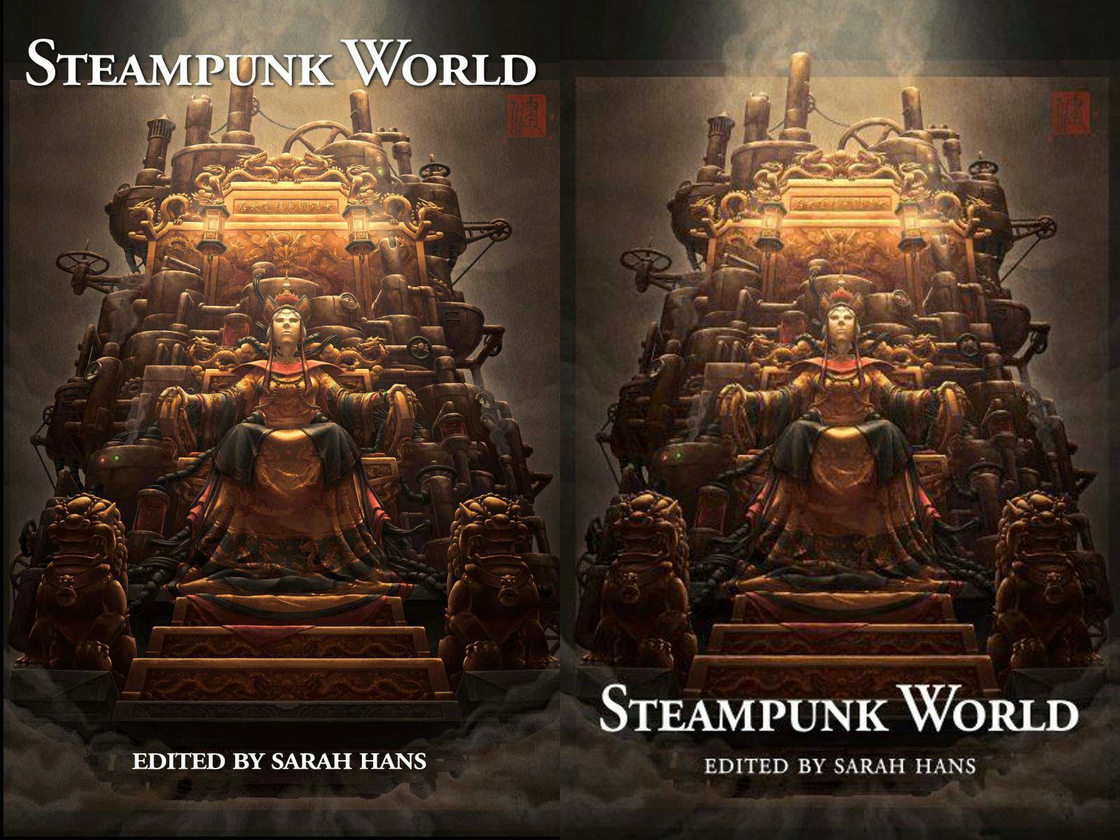
Sometimes it’s the small things that make a big difference. Consider these two variants of the Steampunk World cover:

The original one, on the right, made sense at the time. I wanted (rightly so) to showcase James Ng’s artwork. And anything that people might end up getting from the title – it’s steampunk, and global in scope – is something that you’ll be able to see from the image.
But it’s a year later. And there’s two big reasons I moved the title location.
First, people have heard about the project. It’s not an unknown thing, and even if you weren’t a backer, you probably heard something about it. And so the title alone might get someone to pick up the book now, when they hadn’t before.
 Second, the title is more clearly visible when it’s in a book rack. Check out that photo of my display when I was at a local event this year. I’m reaching the point where I will have to have a book in every row… which means you’ll not get to see the full cover of each book.
This is not a problem I’ve had before. I either had digital books (where this isn’t an issue) or I had books laid out more like the displays in the background in the photo. But now, I simply can’t do that anymore with printed books. I have over a dozen titles in print, and they take up a lot of room – especially when I only have half a table.
Putting the title at the top suddenly means the difference between a title getting seen or being ignored.
So which of the two variants do you like better? Does seeing the title on a display make a difference for you? Or do you judge a book by it’s cover alone?
And don’t forget – you can pre-order Steampunk World right now!
I rarely pick up a book based on cover alone, unless it happens to hit all my particular buttons–it usually has to be a combination of cover and title to twig my interest.
If I _didn't_ see the title, I think you'd have a 50/50 I'd pick up that book, depending on what else was around it (the artwork is lovely, but brown tones are not one of my buttons, I'd be less likely to look closer and see the art).
That said, I much prefer the aesthetics of the title on the bottom there; there's already a lot of detail going on in the top half of the cover, and having the image 'split' the title and byline looks awkward to me, the artwork gets lost behind the two warring sets of stark lettering and you lose the 'eye guide' of where you should look.
The best compromise I can suggest is to put both at the top, possibly 'shifting' the image down slightly to re-balance it if needed.
As another data point, I prefer the one on the left no matter how you're displaying it. I think putting splitting the text makes the whole cover more balanced — it looks like a coherent whole, whereas the one on the right looks like a picture with a bunch of text at the bottom.
If you don't want the title text overlapping the smokestack detail at the top, could you (if there's room in the original art) shift the picture down a bit, so that the "Edited by" text is up on the steps where the title used to be, and the title is clear of the machinery at the top?
Angie
I agree, the one on the left, with the split titles, works better from a design perspective. Because we read top-to-bottom, our eyes are automatically drawn to the top of a page, then travel down. That's where we naturally expect to see the title, headline, etc.
I agree with Angie, though – if it's possible to shift the image down a bit so the smokestacks aren't covered, that would be the best of both worlds.